The Complete Japandi Style Guide : What It Is and How to Get It (2026 Edition)
You’re drawn to interiors that feel both effortlessly calm and quietly beautiful – but every time you try to recreate the look, something feels off: too cold, too cluttered, or just missing that elusive sense of intention. Japandi style is the design philosophy that closes that gap, and in 2026 it has moved from trend to timeless – here’s everything you need to know to get it right.
Quick answer: Japandi style is a hybrid interior design aesthetic that blends Japanese minimalism with Scandinavian warmth, resulting in spaces that are functional, serene, and grounded in natural materials. It prioritises neutral palettes, low-profile furniture, handcrafted objects, and the deliberate removal of excess. To achieve it, edit your space ruthlessly, choose quality natural pieces over quantity, and let imperfection and calm coexist.
What Is Japandi Style? A Clear Definition
The word itself is a portmanteau – Japanese and Scandinavian collapsed into one – but the idea runs deeper than a naming shortcut. Both traditions share a remarkable set of core values: simplicity, reverence for craft, and the belief that natural materials are not just practical but spiritually grounding. Japanese wabi-sabi philosophy and Scandinavian hygge arrive at similar conclusions from opposite ends of the globe, which is exactly why the synthesis feels so coherent rather than forced.
What makes this particular pairing so stable is the shared suspicion of excess. Neither tradition celebrates accumulation. Neither equates more objects with more comfort. That shared restraint is the foundation everything else is built on.
How Japandi Differs from Its Parent Aesthetics
It helps to think of Scandinavian design and Japanese minimalism as two points on a line, with Japandi sitting deliberately between them.
Pure Scandinavian interiors tend toward lighter birch and pine, brighter whites, and a kind of cheerful, domestic warmth – think gathered textiles, candles in clusters, and a slightly more playful object count. Pure Japanese minimalism goes further in the opposite direction: radical emptiness, dark woods, asymmetry, and objects that arrive and depart with the seasons.
Japandi finds the middle ground. It takes Scandi’s warmth and tactile comfort but strips back the accumulation. It takes Japan’s restraint and negative space but softens it with earthy, touchable textures. The result is neither austere nor busy. It feels, when it’s done well, like a deep breath.
A Design Friendship That Has History
This cross-pollination wasn’t invented by Instagram. Scandinavia and Japan have maintained trade and cultural exchange for centuries, and by the early twentieth century, Danish and Japanese designers were already studying each other’s work with genuine mutual admiration. Danish architect Jorn Utzon cited Japanese architecture as a formative influence. The mingei craft movement in Japan found philosophical parallels in the Danish Arts and Crafts tradition. The Japandi aesthetic we identify today is the contemporary expression of something that was always quietly developing beneath the surface of both design cultures.
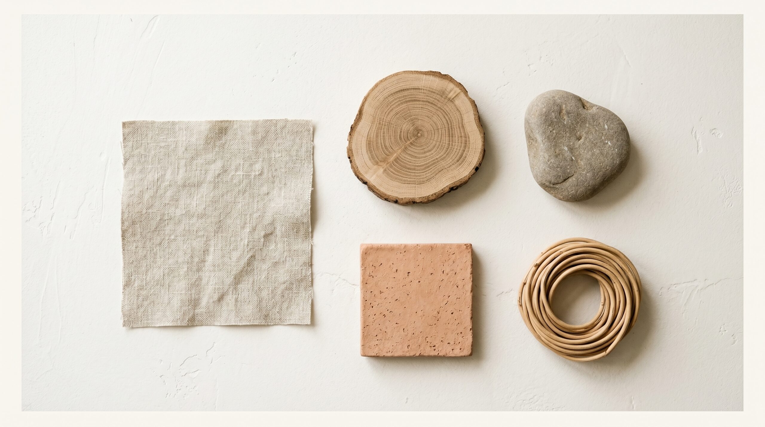
Three objects capture the aesthetic immediately: a rattan tray, a linen throw, and a ceramic bud vase. If you want a starting point before committing to furniture, this kind of curated object set is a low-stakes way to test whether the palette feels right in your actual light.
Why Japandi Design Is More Relevant in 2026 Than Ever
There’s a cultural exhaustion sitting underneath the continued rise of this aesthetic, and it’s worth naming honestly. Post-pandemic, people stopped treating their homes as places to pass through and started treating them as places to actually live – to recover, to think, to rest. Spaces that felt restorative rather than stimulating became desirable in a new and more urgent way. That shift hasn’t reversed. If anything, it has deepened.
The Backlash That Keeps Giving
Maximalism had its moment, and for some rooms it still works beautifully. But for the majority of people navigating overstimulating digital lives, an interior that demands visual attention became its own kind of stress. Search interest in “Japandi aesthetic” has climbed year-on-year into 2026 precisely because the style offers the opposite: a room that lets your nervous system settle.
It’s also worth noting that this isn’t a passive trend. People are actively choosing Japandi as a rejection of something – of the algorithm-optimised shelfie, of the matching-set living room, of the interior that performs personality rather than supporting it.
The Sustainability Alignment
Japandi’s buy-less-buy-better philosophy happens to map directly onto growing consumer concern about fast furniture and environmental waste. Choosing one solid oak piece that lasts thirty years over three flat-pack items that last three is both an aesthetic decision and an ethical one. The two motivations reinforce each other in a way that feels increasingly rare in consumer culture.
Brands like Ethnicraft and Muuto have built their entire proposition around this overlap – sustainably sourced materials, considered production, and designs that don’t date. Buying from them isn’t just a style choice. It’s a position.
What’s New in 2026
The palette has evolved. Alongside the traditional charcoal and warm beige, earthy terracotta and forest green have entered the Japandi canon with confidence. These aren’t departures from the aesthetic – they’re deepenings of it, adding more of the natural world into a design language that was always reaching toward it. The rise of “quiet luxury” positioning has also placed Japandi as the anti-status-symbol status symbol: the person who knows, knows.
The 5 Core Principles of Japandi Aesthetic
Understanding these principles changes how you shop, how you edit, and how you live with your space. They’re not decorating rules – they’re a way of thinking about what a room is actually for.
Principle 1 – Ma: The Presence of Empty Space
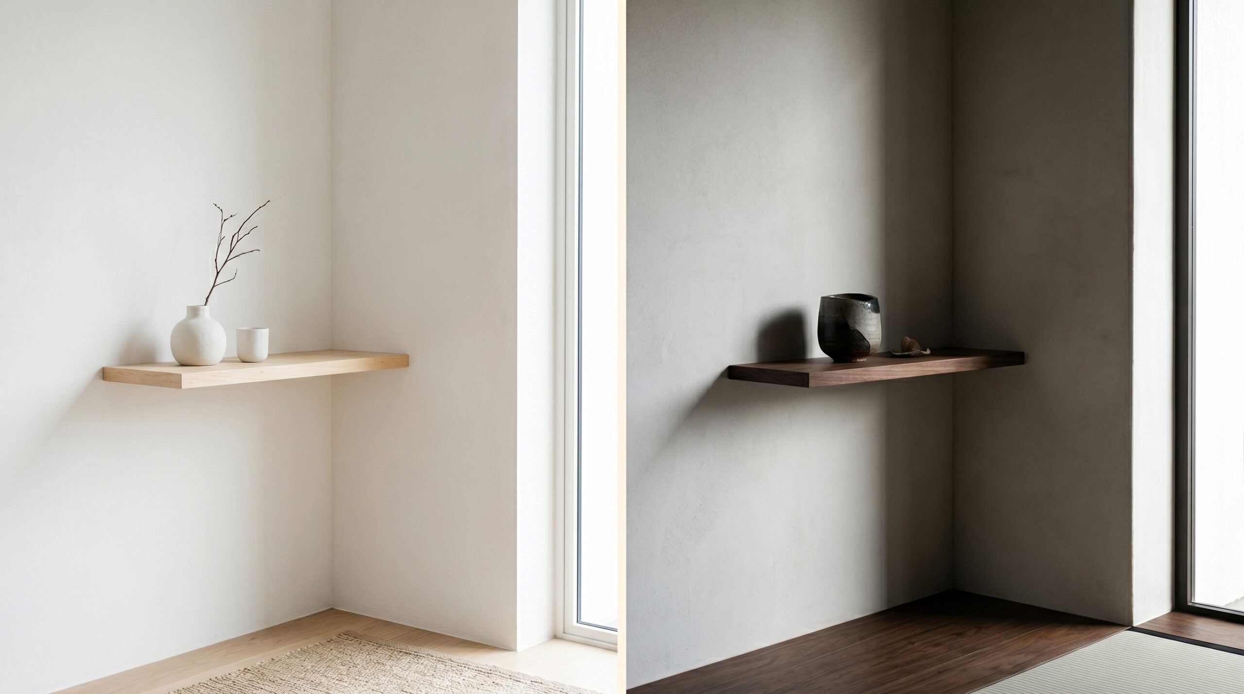
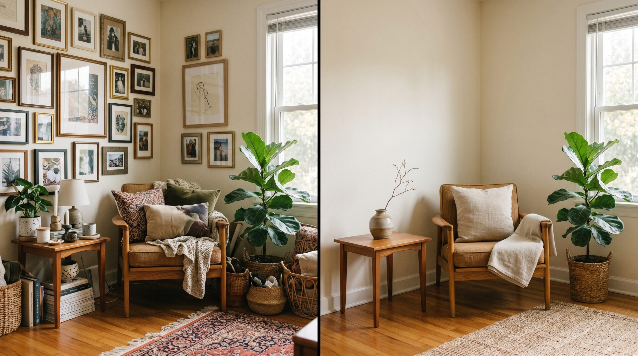
Ma is the Japanese concept of negative space, and it’s probably the most misunderstood idea in all of Japandi design. Empty space in a room is not absence. It’s the breathing room that lets each object be fully seen and fully felt. A surface that is half-occupied commands more presence than one that is fully covered – because your eye can actually arrive somewhere and rest.
This is why Japandi rooms feel calm even when they contain beautiful objects. The objects have room to exist. In practice, Ma means resisting the urge to fill a shelf just because it’s there, or to add one more cushion because the sofa looks sparse. The sparseness is the point.
Principle 2 – Wabi-Sabi: The Beauty of Imperfection
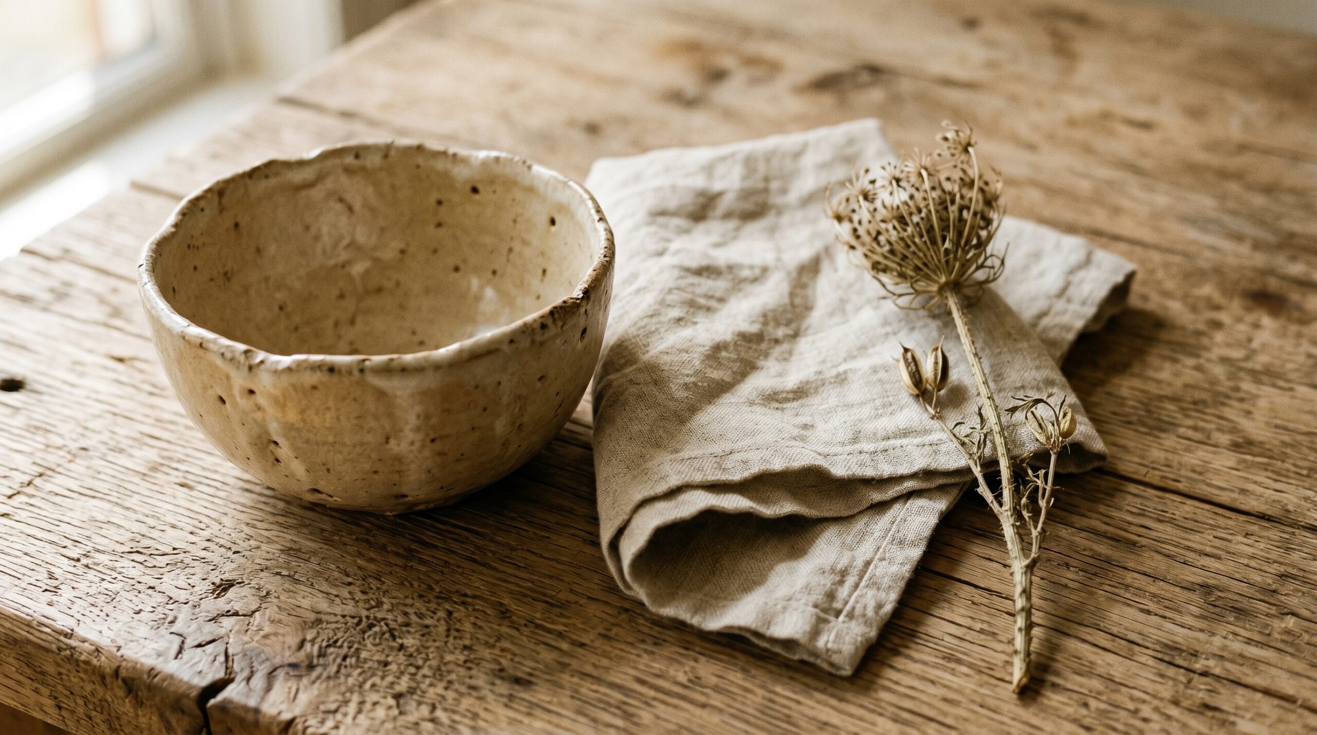
A chipped ceramic mug is not a problem. A knot in the wood grain is not a flaw. Wabi-sabi is the Japanese philosophy of finding beauty in what is imperfect, impermanent, and incomplete – and in a Japandi interior, it’s the quality that saves the aesthetic from feeling like a showroom. A room that looks too perfect feels unliveable. Wabi-sabi gives you permission to let the linen wrinkle, to keep the ceramic with the uneven rim, to leave the aged patina on the brass handle rather than polishing it away. If you want to go deeper on this idea, the wabi-sabi living guide covers it thoroughly.
Principle 3 – Functional Beauty
This is where the Mingei craft tradition from Japan meets Scandinavian functionalism, and the two shake hands warmly. Every object in a Japandi room must earn its place by being both useful and genuinely beautiful.
Decorative-only pieces are edited out. Not because beauty doesn’t matter – but because in this framework, beauty and function are inseparable. A handthrown ceramic pitcher that holds water and looks extraordinary doing it is the ideal Japandi object. A sculptural vase that holds nothing and serves only to be looked at is a harder case to make.
Principles 4 and 5: Palette and Material
Principle 4 is the muted natural palette – warm whites, oats, putties, deep charcoals, and earthy greens, never more than three tones in a room at once. This constraint sounds limiting until you experience how much depth you can create within it using texture alone.
Principle 5 is the material commitment: wood, linen, stone, clay, and rattan over plastic, chrome, or high-gloss synthetics. Natural materials age in ways that are beautiful. Most manufactured surfaces just deteriorate. That’s not a small distinction when you’re making a thirty-year furniture decision.
Five objects that embody all five principles at once: a wabi-sabi ceramic bowl, a solid oak tray, a linen cushion cover, a beeswax candle, and a single dried pampas stem in a stoneware vase. These aren’t accessories – they’re a philosophy made tangible.
Japandi Design Ideas for Every Room in Your Home
The principles stay constant. The application shifts room by room.
Living Room
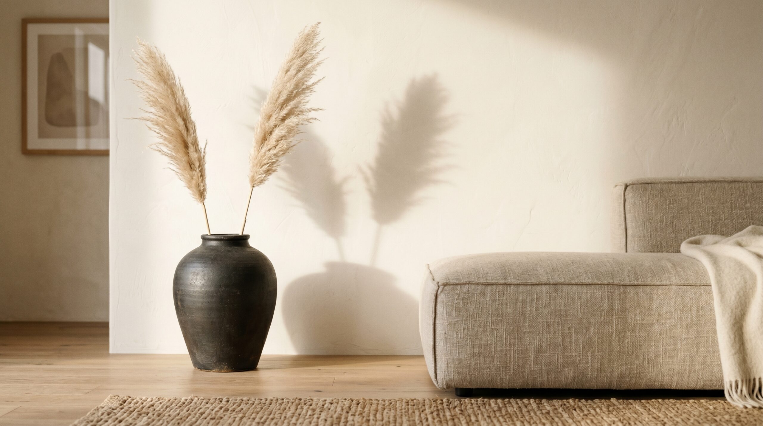
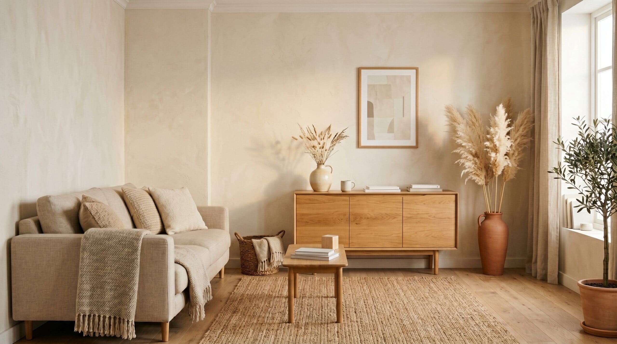
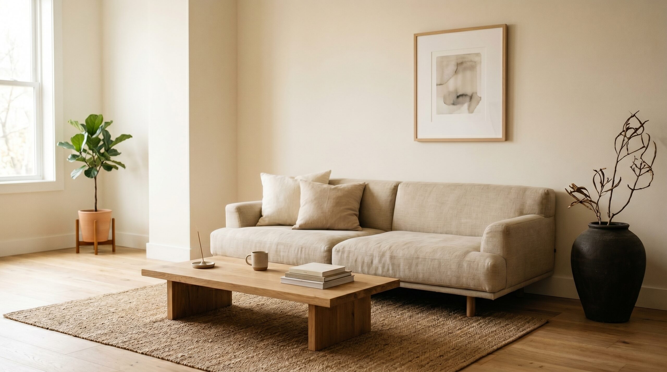
A low-profile sofa in oatmeal or charcoal bouclé is the anchor. Pair it with a solid wood coffee table that sits close to the floor – this lowers the visual centre of gravity of the whole room and immediately reads as Japandi rather than generic contemporary. One large ceramic floor vase. A single piece of art with wide, breathing matting. No gallery walls – they introduce exactly the kind of visual noise this aesthetic is trying to quiet.
Rugs matter more than most people expect in a Japandi living room. A flatweave jute or undyed wool rug laid directly on pale timber flooring adds that crucial layer of natural texture without introducing pattern or colour. Keep it large enough to sit under the front legs of the sofa – a rug that floats in the centre of a room always looks hesitant.
The COPIAE Sofa Couch is a practical example that hits the silhouette without requiring a designer budget.
Bedroom
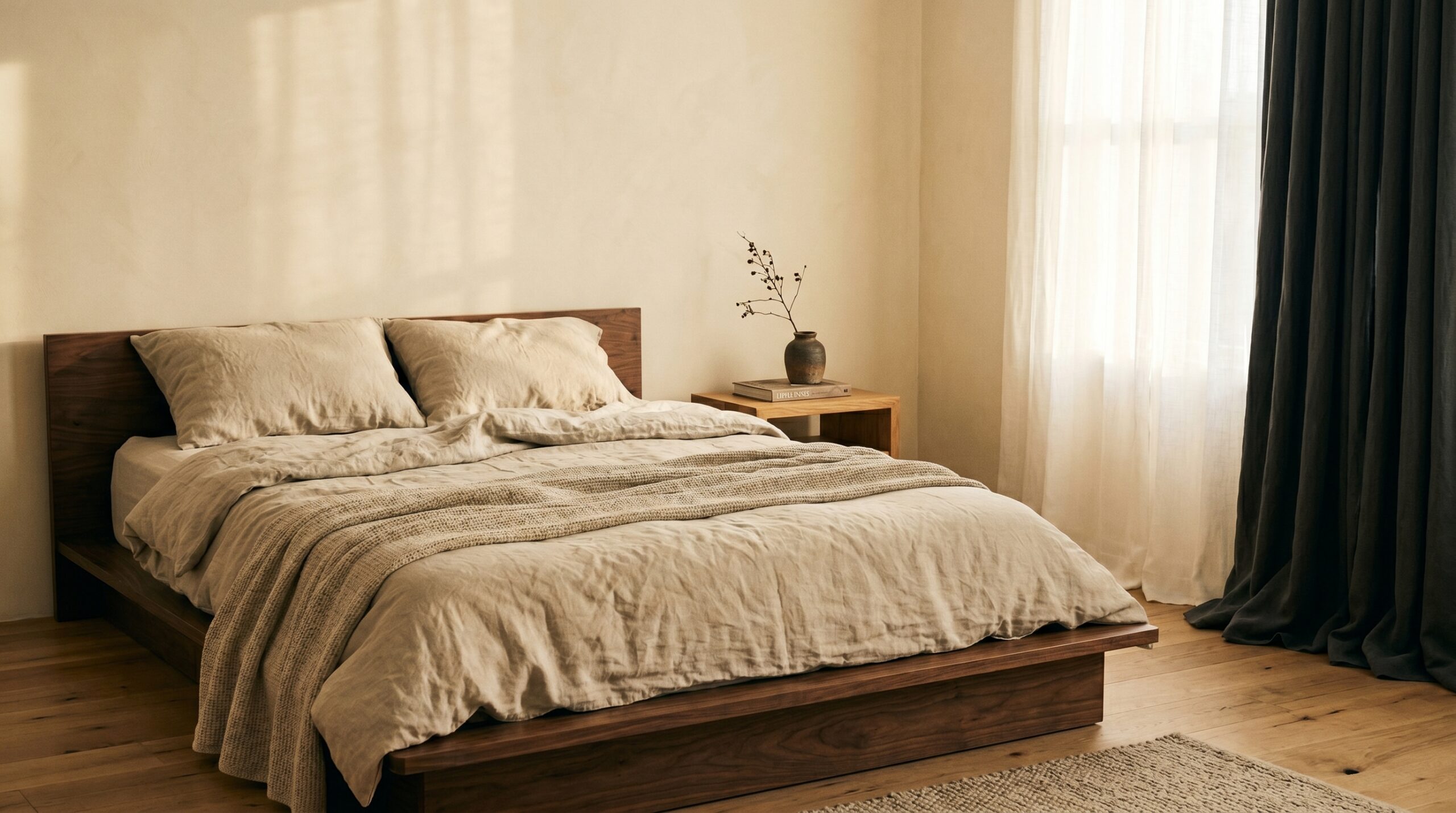
Platform beds in dark walnut or bleached oak, with monochrome linen bedding that’s lived-in rather than pressed. One bedside table per person – holding one book and one object, nothing more. Blackout linen curtains that pool very slightly on the floor: this one detail adds a softness that reads as considered rather than careless.
Storage in a Japandi bedroom is hidden, always. Built-in wardrobes with flat push-to-open fronts, or a low tansu-style chest in solid wood – either keeps the room feeling resolved rather than managed. The goal is a space where nothing is visually demanding first thing in the morning. For a full treatment of this room, the Japandi bedroom ideas guide goes much further.
The Talasily linen sheet set is worth mentioning here – it wrinkles in exactly the right way.
Kitchen and Bathroom
Open shelving only when the objects on it are curated – mismatched spice jars and cooking spray don’t belong in view. Integrated appliances behind flat-front cabinetry make kitchens feel resolved rather than busy. IKEA’s KUNGSBACKA fronts are a well-known hack for achieving this at an accessible price point.
In bathrooms, handthrown soap dishes and ceramic canisters replace the plastic organiser sets that undermine every other good decision in the room. Natural stone or zellige tile on a single feature wall adds texture without pattern overload. Keep towels in one colour – warm white or oatmeal linen – folded and stacked rather than hung on multiple rails.
How to Build a Japandi Colour Palette That Actually Works
Colour is where Japandi rooms succeed or quietly fall apart. Most people go wrong by either playing it too safe or misunderstanding what “neutral” actually means in this context.
The Logic Behind the Palette
Start with base neutrals – warm white, oat, putty, or greige – and choose one deep anchor tone to carry the room. Charcoal works in almost any light. Forest green is having a strong 2026 moment. Ink navy is richer and more unexpected. Terracotta clay adds warmth without sweetness. The rule is three tones maximum in any single room, and they should all read as belonging to the same piece of earth.
Greige is passive – Japandi neutrals are intentional. That’s a meaningful distinction when you’re standing in the paint aisle wondering why two colours that look almost identical feel completely different in a room.
What to Actively Avoid
Cool grey reads corporate – it belongs in offices, not in spaces meant for recovery. Bright white is too clinical, too reflective, too demanding. Warm yellow pulls the whole thing toward cheerful when you want calm. These aren’t arbitrary restrictions: each of these colours introduces an energy that works against what Japandi is trying to do.
Before committing to a wall colour, test it with large peel-and-stick swatches rather than the small paint chips that tell you almost nothing. Observe the swatch through a full day of light – morning, midday, and evening lamplight will all read differently, and Japandi colours tend to shift more dramatically than you’d expect. Farrow and Ball’s ‘Mole’s Breath’ or ‘Purbeck Stone’ are both genuinely Japandi-approved – complex warm neutrals with enough grey to anchor them without cooling the room down.
The 2026 Accent Update
Muted sage, terracotta clay, and moss have arrived as acceptable Japandi accent colours. They maintain the earthy, grounded character without breaking the three-tone rule – because they all still read as natural, as belonging to a forest floor or a riverbank rather than a paint chart. Use them as cushion covers, a single painted door, or a throw rather than a full wall, and they integrate without overpowering.
How to Achieve Japandi Style Step by Step
This is where it becomes practical. Six steps, in order – and the order genuinely matters.
Steps 1 and 2 – Edit, Then Anchor
Walk every room and remove anything that doesn’t serve a function or bring genuine calm. Box items rather than immediately donating – a thirty-day holding period clarifies which decisions are emotional and which are right. Most things in the box will stay there. Then choose your anchor furniture before doing anything else. One quality low-profile sofa or bed frame sets the tone for the whole room. Don’t accessorise until the bones are correct – adding layers to a wrong foundation just creates an expensive version of the same problem.
A linen storage basket for the decluttered items during the holding period is both practical and – fittingly – very much in the spirit of the thing.
Steps 3 and 4 – Layer and Grow
Layer natural materials in odd numbers: one wood surface, one linen textile, one stone or ceramic object per zone. Three different natural textures in the same neutral family prevent sterility without introducing clutter. The variety is tactile, not visual – which is exactly what a Japandi room is going for.
Then bring in one living thing. A monstera, a snake plant, a bonsai, or a simple branch of dried botanicals. One. Not a collection – a presence. A bonsai starter kit is a more considered option than a generic houseplant, and it carries a specific cultural resonance within the Japandi philosophy that a trailing pothos, however lovely, doesn’t quite match.
Steps 5 and 6 – Light and Final Edit
Swap overhead fixtures for paper pendants in the Noguchi tradition or low-wattage wall sconces that wash light downward rather than flooding the ceiling. The quality of light in a Japandi room is warm, directional, and low – never bright and even. An Hytsoeee pendant lamp or a more considered alternative achieves this without significant investment. Add a beeswax candle cluster. Cover any LED strips.
Then stand at the door, squint slightly, and note whatever your eye snags on unnecessarily. That object leaves. This final step sounds simple, but it catches the things the rational mind talked itself into keeping.
Common Japandi Mistakes and How to Avoid Them
Most Japandi mistakes fall into one of three categories. Knowing them in advance saves both money and a second round of editing.
Mistake 1 – Confusing Japandi with “Just Beige”
This is the most common error, and it produces rooms that are genuinely dull rather than intentionally calm. Japandi is warm and deeply textured – the neutrality lives in the colour, not in the surface quality. Layering linen, visible wood grain, and matte ceramics within the same neutral family creates extraordinary depth. The room looks complex. It just sounds simple when you describe it.
The fix is to think in textures before you think in colours. If every surface in a room has a different tactile quality – rough, smooth, woven, grained, matte – the space will read as rich even in a palette of three near-identical neutrals.
Mistake 2 – Over-Editing into Coldness
There’s a point past which editing stops being Japandi and starts being a vacancy. Removing too much personality strips away the wabi-sabi warmth that defines the aesthetic. One genuinely imperfect handmade object per room isn’t optional – it’s the thing that gives the space a soul rather than a concept. A room that photographs perfectly but feels uncomfortable to sit in has been over-edited.
Mistake 3 – Buying Everything at Once from One Retailer
Japandi rooms look considered because they were genuinely collected over time. A matching set from a single catalogue signals exactly that – one shopping session, one aesthetic frame, no real curation. The combination of one vintage piece, one handmade ceramic, and one quality furniture investment always beats a coordinated set.
Etsy’s wabi-sabi ceramics section and vintage marketplaces like Vinterior or Chairish are the antidote – and the finds are usually more interesting anyway. A bowl that was made by a specific person in a specific place carries a presence that factory production simply can’t replicate.
Expert Tips for Getting the Japandi Aesthetic Right
These three tips are the ones that change outcomes rather than just refine them.
Tip 1 – Shop Your Own Home First
Most homes already contain one or two objects that fit the Japandi ethos – a wooden bowl that’s been in the kitchen for years, a linen scarf that never found a home, a ceramic cup brought back from somewhere. Identify these objects before spending anything, and build outward from them. They become your anchors, and everything else either harmonises or leaves.
This matters practically as well as philosophically. Starting from objects you already love means the space will feel personal from the beginning, rather than assembled. That’s the difference between a Japandi room and a Japandi showroom.
Tip 2 – Make “One In, One Out” Permanent
Japandi is not a one-time project. It’s an ongoing editing practice. Every new purchase should displace one existing object – not because the rules demand it, but because the spatial integrity of the space depends on it. Letting objects accumulate gradually is how Japandi rooms quietly stop being Japandi rooms.
It’s also, practically, a very good spending brake. When a purchase requires you to identify what it replaces, impulse buying becomes considerably harder to justify.
Tip 3 – Invest Where It’s Touched Daily
Bed linen, a sofa, a dining chair – these justify higher spend because you interact with them every single day, and quality materials feel meaningfully different from cheaper alternatives. The weight of good linen, the give of a well-made cushion, the solidity of a jointed wood frame – these things register below conscious awareness and contribute directly to how a room feels to be in.
A set of Simple&Opulence in Bed linen sheets will feel better every morning for a decade. Decorative shelf objects, on the other hand, can absolutely be thrifted from Facebook Marketplace or Vinterior without any compromise to the overall effect. Spend on what you touch. Source cleverly for what you look at.
For those working with a tighter overall budget, the Japandi on a budget guide covers every room with specific sourcing strategies and honest prioritisation advice.
If you want to go further – materials, furniture selection, layout principles, and room-by-room sourcing – the full Noro Decor Japandi Style Guide covers all of it from the same practical angle.
Related Reads
- Japandi Color Palette: 9 Schemes That Actually Work in Real Homes
- Japandi vs Scandinavian vs Minimalist: The Differences Nobody Explains
- The 7 Japandi Design Principles Every Quiet Home Follows
- 11 Japandi Mistakes That Make Spaces Feel Cold (And the Fix)
- Japandi Materials Guide: Linen, Wool, Wood, Stone, Paper
Frequently Asked Questions
What is Japandi style in simple terms?
Japandi style is an interior design aesthetic that combines Japanese minimalism with Scandinavian warmth. It focuses on natural materials, a muted neutral palette, low-profile furniture, and the philosophy that every object should be both functional and beautiful. The result is a space that feels calm, considered, and quietly luxurious without demanding attention.
How is Japandi different from Scandinavian design?
Scandinavian design tends toward lighter woods, brighter whites, and a cosier, more playful warmth. Japandi pulls this toward a deeper, more meditative calm – introducing darker wood tones, a more restrained object count, and the Japanese wabi-sabi acceptance of imperfection that pure Scandi design doesn’t typically emphasise. It’s the same warmth, held more quietly.
What colours are used in Japandi interiors?
Japandi colour palettes centre on warm neutrals – oat, putty, warm white, and greige – anchored by one deep tone such as charcoal, forest green, or terracotta. Avoid cool greys and bright whites. In 2026, muted sage and clay terracotta have become popular accent additions while staying within the earthy, grounded character of the style.
How do I start decorating in a Japandi style on a budget?
Start by editing out clutter rather than buying anything new. Then identify two or three existing pieces that feel calm and natural, and build around them. Source handmade ceramics on Etsy, vintage furniture from thrift stores, and use affordable linen-look textiles from IKEA. Japandi rewards restraint, so less spending often produces better results than more.
What furniture works best for a Japandi aesthetic?
Low-profile, solid-wood furniture in warm walnut, oak, or bleached ash works best. Look for clean lines without ornate detailing, visible joinery as a design feature, and pieces that sit closer to the floor than Western-standard height. Avoid furniture with chrome legs, high-gloss finishes, or overly sculptural shapes that draw attention to themselves rather than receding into the room.
Should I use plants in a Japandi room?
Yes, but sparingly. One well-chosen plant per room is the Japandi rule – a sculptural monstera, a bonsai, a snake plant, or a simple arrangement of dried botanicals. The plant should feel intentional, not decorative filler. Avoid clusters of small pots or trailing shelf plants, which add visual noise rather than natural calm.
What is wabi-sabi and how does it relate to Japandi?
Wabi-sabi is the Japanese philosophy of finding beauty in imperfection, impermanence, and incompleteness. In Japandi interiors, it shows up as a preference for handmade ceramics with uneven glazes, aged wood with visible grain, and linen that wrinkles naturally. It’s the quality that stops Japandi from feeling clinical and gives it genuine warmth and soul.
Can Japandi style work in a small apartment?
Japandi is arguably at its best in small spaces. Its emphasis on negative space, multi-functional furniture, and strict object editing means small rooms feel intentional rather than cramped. Low-profile furniture creates the illusion of height, and a consistent muted palette unifies a compact floor plan into one cohesive, calm environment rather than a series of disconnected corners.